
AI-First Data Analytics
Form follows function. And when the function shifts to AI, the dashboard must change.

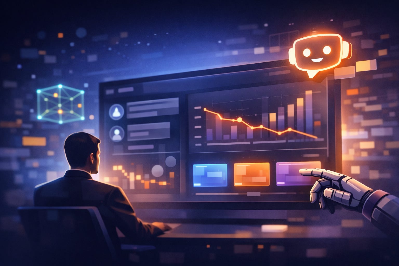
Bolting a chatbot onto your database isn’t AI-powered analytics—it’s a chatbot sitting next to your database. The interface needs to change more fundamentally than that. But how?
Dashboards aren’t about displaying data anymore. They’re about mediating a conversation between humans and AI about their data. This shift changes everything about how we design analytics interfaces. The chart that used to be the hero of your dashboard? It’s now supporting evidence. The drills and filters you spent weeks perfecting? Optional. The navigation hierarchy that users had to memorize? Irrelevant once the UI dynamically adapts to the content.
The chart that used to be the hero of your dashboard? It’s now supporting evidence.
In 2026, we’re not tweaking dashboards. We’re redesigning what a dashboard even is. The question isn’t whether AI will transform data analytics — it already has. The question is what does the interface look like when the intention, thinking, and evaluation stay with the user, while the mechanics and heavy lifting of analysis shift to AI?
Of course, some things do not change. Like the core use cases that underpin all data analytics. These remain stable, whether a dashboard is AI-powered or not:
Know — What is happening?
Understand — Why is it happening?
Act — What should we do about it?
What Actually Changes for the User?
These universal use cases are here to stay, no matter which AI model is currently around. The most significant change happens with the role of the user:
You ask questions → AI anticipates questions
You search for insights → AI surfaces insights
You interpret data → AI explains data
You decide → AI recommends and you decide
You act → AI acts and you supervise
Each of these shifts changes how users actually interact with analytics. Let’s unpack what each shift means for the user experience.
From Asking to Anticipating
You used to come to the dashboard with questions. “What happened yesterday? How are we tracking against the target? Which region is underperforming?” You’d navigate to the right view, apply the right filters, and search for answers.
Now the system tells you before you ask. You open the tool, and it says: “Here’s what changed since yesterday. Here’s what needs attention. Here’s something unusual in the Midwest data.” You still ask questions when you have them—in plain English now, not through filter menus—but the starting point has shifted. You’re responding to insights, not hunting for them.
From Searching to Surfacing
You used to spend your mornings clicking through dashboards. Drill into this segment. Filter by that date range. Compare these two regions. Scan the charts for anything that looks off. Most of the time, you find nothing. Sometimes you miss something important.
Now the system does the hunting for you. Patterns you didn’t know existed show up in your feed. When sales drop, you don’t discover the drop and then spend an hour figuring out why —the system tells you both at once. You move from reacting (”what happened?”) to anticipating (”what’s about to happen?”). The anomaly doesn’t just get flagged; it gets explained.
From Interpreting to Understanding
You used to stare at charts and decode them. Is that spike significant or noise? Is this trend good or bad? What does a 12% drop actually mean in context? The visualization gave you data; turning it into meaning was your job.
Now meaning comes first. You see: “Revenue dropped 12% last week, driven by a logistics delay affecting three distribution centers.” Then you see the chart that proves it. You’re not puzzling over visualizations anymore—you’re reviewing conclusions and deciding whether to act on them.
From Deciding Alone to Deciding with Recommendations
You used to gather the data, weigh the options, and make the call. The dashboard gave you information; synthesis was on you. You’d build your own mental model of trade-offs, often missing factors you didn’t know to look for.
Now the system does the synthesis. It shows you what to consider based on your data and your organization’s know-how. It runs the scenarios: “If you increase the price by 5%, expect this. If you hold, expect that.” It compares options with explicit trade-offs and tells you how confident it is in each projection. You still decide—but you decide faster, with better information, and with fewer blind spots.
From Acting to Supervising
You used to be the one who made things happen. See the insight, make the decision, execute the action, track the result. Every step required your attention.
Now you set the guardrails and the system operates within them. Workflows trigger automatically when conditions are met — reorder inventory when stock drops below threshold, adjust bids when performance falls outside range, flag accounts when patterns suggest churn. Parameters are optimized continuously based on what actually works. Your job shifts from doing to supervising: defining the boundaries, reviewing the outcomes, stepping in when judgment is needed. The system acts; you course-correct.
Form Follows Function
These aren’t incremental improvements—they are a fundamental shift in what analytics does. And a shift in function demands a shift in form. The interface patterns we’ve relied on for decades — static dashboards, filter hierarchies, chart grids — weren’t designed for this. So what replaces them? That is the UX question that matters. Here’s how the interface fundamentally shifts:
Information Flow: From Push to Pull
You used to go to the dashboard. Open the tool, scan the charts, and figure out what’s important. That’s pull — and it assumes you know when to check and what to look for.
AI-first analytics inverts this. The system pushes what matters into your workflow: alerts when metrics shift, summaries of overnight changes, and anomalies surfaced before you ask. This turns the home screen from a wall of charts into a personalized briefing. Notifications and feeds become primary interfaces. The dashboard doesn’t disappear, but it changes role — it becomes where you go to dig deeper, not where you start.
Views adapt too. Pre-built layouts assume everyone needs the same thing at the same time. They don’t. AI-enhanced dashboards reconfigure based on context, user role, and the question being asked. What’s relevant right now takes center stage, not what someone thought might be relevant when they built the layout six months ago.
Interaction Model: Dialogue Replaces Navigation
You used to click through filters, drill down hierarchies, and learn where things live. The dashboard had a structure; your job was to master it.
AI-first analytics lets you skip the navigation. Type “Why did revenue drop last week?” and get an answer. The query bar becomes as important as the chart area—because asking is faster than clicking. Chat interfaces appear alongside (or instead of) traditional controls. Filters don’t disappear, but they become suggestions, not requirements.
The bigger shift is that interaction becomes bidirectional. Traditional dashboards show; you look. End of exchange. AI-enhanced dashboards propose hypotheses and invite response: “Here’s what I think is happening” — and you validate, push back, or ask for more. This means new UI patterns: feedback buttons (”Was this helpful?”), refinement controls (”Focus on this segment instead”), trust indicators showing confidence levels and related data sources. The relationship becomes conversational.
Presentation: Narratives Replace Charts
You used to stare at visualizations and decode them. Is that spike significant? Is this trend good or bad? The charts gave you the data; it was your job to extract the insights.
AI-first analytics leads with explanation: “Revenue dropped 12% last week because of a logistics delay in the Midwest.” Then comes the chart that proves it. Text stops being an afterthought—labels, titles, footnotes—and becomes the primary content. Visual density matters less than reading flow. The interface is designed to be read, not just scanned.
This also changes how you navigate complexity. “Here’s your data, go explore” sounds empowering until you’re staring at 47 metrics, wondering where to start. AI-enhanced interfaces tell you where to look and why. Guided pathways replace aimless wandering. Related insights and suggested next steps appear automatically. Progressive disclosure shifts from user-driven (click to see more) to AI-driven (here’s what you probably want next).
The Core UI Tensions to Resolve
Here’s the catch: every shift creates tension. Give users too much AI, and they lose control. Give them too little, and you’ve wasted the technology’s potential. You can’t have it all, at least not without careful design choices. These are the core trade-offs:
Chat vs. Dashboard: when to converse vs. when to visualize?
Proactive vs. Overwhelming: how much information should AI provide?
Trust vs. Automation: how much control does the user need to maintain?
Simplicity vs. Power: how do you preserve capability while concealing complexity?
Personalization vs. Consistency: how do you adapt views without disorienting users?
Each tension demands a design decision:
Turn-taking: Who speaks when? User, AI, or data?
Progressive disclosure: How to reveal depth without cluttering the surface?
Explanatory design: How does AI show its reasoning and elicit trust?
Error recovery: What happens when AI gets it wrong? Can the AI admit it?
Agency preservation: How does the user stay in control?
The Interface Worth Building
Remember where we started? A chatbot next to your database isn’t AI analytics. But now we can see what the alternative might look like — an interface that anticipates questions, surfaces insights, explains itself, recommends actions, and operates within guardrails. Not a dashboard with AI. A conversation with AI about your data, mediated by the right design.
The user opening an analytics tool in 2026 doesn’t want to hunt for insights, decode charts, or navigate filter hierarchies. They want answers. They want explanations. They want to decide and move on. Every interface choice we make either serves that goal or gets in the way. The dashboard isn’t dead — but its job has changed. It’s no longer about displaying data. Dashboard is about making data useful to humans who have better things to do than stare at charts. That’s the interface worth building. Design accordingly.